Why ASCII Art Spacing Breaks in WhatsApp, Reddit, and Email
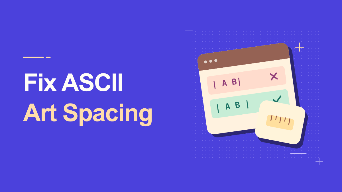
An ASCII cat can be perfect in your editor and unrecognizable after you paste it into a message. The spaces shift, a line wraps, and the nose ends up next to the tail. This happens because text art assumes a grid, while many messaging apps and emails use proportional fonts or alter whitespace. The solution is not one magic copy button. You need to select art that fits the platform and use whatever monospace or preformatted text support the destination provides.
Understanding Why Ascii Art Spacing Breaks
A monospace font gives each character approximately the same horizontal advance, making columns line up. Proportional fonts give letters such as i and W different widths, which is better for everyday reading but poor for text pictures. Platforms may also trim repeated spaces, insert line breaks, or apply Markdown. A generator can create correct art, yet the receiving app can still change how it looks. Troubleshooting starts with the destination, not just the source.
ASCII art turns ordinary characters into pictures, banners, or large letterforms. Many generators create the shapes with letters, slashes, underscores, and spaces. Because alignment depends on equal character widths, the result generally needs a monospace font and preserved line breaks. A proportional font may make an otherwise correct banner look broken.
Practical Steps for Why Ascii Art Spacing Breaks
1. Inspect the original art in a plain editor
Copy the block from Text to ASCII Art into a plain text area. Confirm the lines, leading spaces, and punctuation. If it is broken before you send it, regenerate using a smaller style or disable automatic text replacement in your editor.
2. Use monospace formatting where supported
WhatsApp documents a monospace format using three backticks around the text. Reddit's formatting options depend on its editor and current interface; a code block is usually more appropriate than regular paragraph text. In email, prefer a plain-text message or an explicitly preformatted block when the client supports it.
3. Check line length against the smallest screen
Even a monospace block can overflow on a phone. If the longest line is wide, shorten the phrase, remove decorative columns, or choose a compact font. This addresses the practical problem instead of hoping the app will preserve an impossible width.
A helpful way to check this step is to pause before publishing: look at the preview at actual phone size, confirm the main words are still readable, and try a plain-text version if a platform changes the characters.
4. Avoid tabs and smart punctuation
Tabs can expand to different numbers of spaces. Smart quotes or special replacements may change character widths. Keep plain spaces and basic punctuation in art intended for maximum portability. If the art relies on Unicode box-drawing symbols, test those separately.
5. Switch to an image when pixels matter
If you need the exact pattern to appear the same in an invitation or announcement, export or screenshot it as an image. Add alternative text or the original phrase in the message so the design remains understandable when images are unavailable.
Keep a copy of your original wording outside the generator. That makes it easy to revise the message, compare versions, or retry a simpler style when the destination does not support every symbol.
Practical Examples You Can Adapt
WhatsApp text smile
A small two-line face may work in a monospace message; a six-line banner may still wrap in a narrow bubble. Test the draft on your phone and keep lines short. The important detail is not the number of spaces but whether the recipient can see a coherent picture.
Long README-style banner in email
Email signatures and newsletter editors frequently apply proportional fonts or trim whitespace. A big banner can break across clients. For professional communication, a normal heading or an attached image is usually more dependable than a complex text-art signature.
Why Why Ascii Art Spacing Breaks Can Look Different
The word ASCII is often used loosely online. Strict ASCII covers a small original character set; modern 'text art' can include box-drawing symbols, Unicode blocks, or emoji. Those variants may look richer but will not necessarily render in every terminal or legacy environment. Choose a plain-character output if portability matters more than decoration.
Reddit editor changes formatting
Rich-text and Markdown editors can represent spaces and code differently. Check the editor mode and preview before posting. If a code block is unavailable or becomes awkward on mobile, reduce the art to a compact version.
Copied lines include invisible characters
Some sources contain nonbreaking spaces, tabs, or hidden Unicode formatting characters. If alignment remains strange, regenerate with a basic character set and paste via a plain-text editor to isolate the source of the problem.
Diagnose the Failure One Layer at a Time
Start with the simplest possible art: a small square made from plus signs, hyphens, vertical bars, and spaces. If it breaks, the destination is probably altering whitespace or displaying unequal character widths. Try a monospace formatting option if the application offers one. If the square works but a larger banner fails, the problem is likely wrapping rather than character selection. If only shaded Unicode artwork fails, missing glyphs or unequal symbol widths may be involved. One small experiment can identify the issue more clearly than repeated copy-and-paste attempts.
Email introduces a further distinction between plain-text and HTML rendering. A signature in a rich-text composer may be reflowed by the recipient's mail client. If the exact appearance matters professionally, a simple image with descriptive alternative text is usually more reliable than complex art built from spaces. For casual chat, use compact character designs and accept that slight variations are part of the medium. Do not depend on the art to convey important information that disappears if alignment fails.
Practical Tips for Why Ascii Art Spacing Breaks
When debugging, change one variable at a time. First replace the font style with a compact version; next add code formatting; then test on mobile. If you change all three simultaneously, it is hard to know what solved the issue. Keep the original raw art and the successful final version in separate notes. A small, well-aligned text picture is often more delightful than a huge one that only displays correctly on your computer.
Preview the final block where it will be published. Markdown code fences are useful in documentation and chat applications that support them. For a terminal, inspect the result against its column width; for a narrow phone, choose a short word or compact style. Reducing width often fixes a problem that no amount of re-copying can solve.
Frequently Asked Questions
Why is ASCII art broken after pasting?
Usually the destination changes font metrics, whitespace, or wrapping. Preserve plain spaces and line breaks, then use monospace formatting when possible.
Can I put a multiline ASCII drawing in an email subject?
Use the subject for a short label and place the drawing in the message body. A subject is displayed as a single line or clipped in many inboxes, so it cannot reliably carry the rows of the artwork.
Should I use spaces or tabs?
Spaces are normally safer for portability. Tabs can expand differently across applications and make columns shift.
Try It Yourself
Once you know the outcome you want, open the Ascii tool, enter a short sample, and adjust the result until it remains useful in its destination. For a related approach, read this companion guide. Try the simplest version first, then add decoration only where it improves the message.