ASCII Art Fonts Explained: FIGlet, Block Letters, and Text Banners
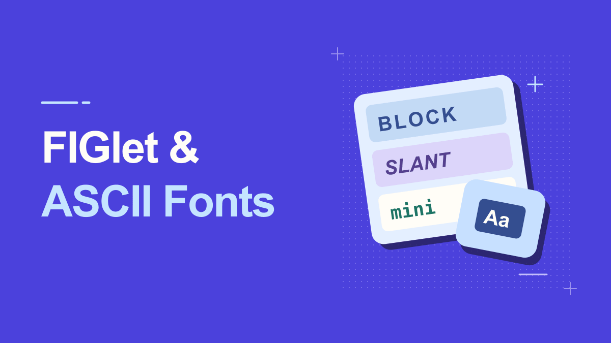
When you select a font in an ASCII art generator, you are often choosing a pattern for drawing large letters, not installing a typeface like Arial or Georgia. FIGlet-style lettering converts each input character into a multi-line arrangement of printable symbols. Some results are bold and squared, others are slanted or delicate. Understanding these styles helps you choose a banner for a terminal, Discord message, README, or retro graphic. It also prevents the common mistake of choosing a decorative font that is too wide for its destination.
Understanding Ascii Art Fonts Figlet
The classic FIGlet project produces large characters from ordinary screen characters and supports different font definitions and spacing behaviors. Font names such as standard, slant, big, small, shadow, and block describe useful visual families, although individual generators may implement a different selection. In this context, 'font' means a recipe for constructing letter pictures. It does not necessarily mean that the output is compatible with every application that accepts normal text.
ASCII art turns ordinary characters into pictures, banners, or large letterforms. Many generators create the shapes with letters, slashes, underscores, and spaces. Because alignment depends on equal character widths, the result generally needs a monospace font and preserved line breaks. A proportional font may make an otherwise correct banner look broken.
Practical Steps for Ascii Art Fonts Figlet
1. Start with the standard style
A standard text banner is a useful baseline because letter shapes are generally recognizable and the output is easier to debug. Enter a short word in Text to ASCII Art and observe the height, longest line, and use of punctuation. Compare all other styles against this version.
2. Try block and big-letter styles
Block styles emphasize strong rectangular shapes and can work well for logos or terminal splash screens. They also consume more columns. Choose them for short words where the available width is generous rather than for long explanatory sentences.
3. Use slant styles for dynamic titles
Slanted letters create the impression of movement and can make a banner feel more energetic. Their diagonal construction may be sensitive to spacing errors, so copy the art exactly. A missing leading space can shift the entire shape.
A helpful way to check this step is to pause before publishing: look at the preview at actual phone size, confirm the main words are still readable, and try a plain-text version if a platform changes the characters.
4. Compare small and compact variants
Small fonts are often more practical inside chat windows and narrow documentation columns. They sacrifice some detail to reduce line width. If your message must work on a phone, a compact style may be more effective than a dramatic six-line block.
5. Learn the difference between plain ASCII and Unicode art
Some generators offer decorative shading or box-drawing characters outside the original ASCII set. Those can be attractive but introduce font-width and compatibility questions. Use plain-character results for older terminals or systems where predictable rendering matters.
Keep a copy of your original wording outside the generator. That makes it easy to revise the message, compare versions, or retry a simpler style when the destination does not support every symbol.
Practical Examples You Can Adapt
Personal project banner
For a repository called 'NOVA', compare a standard style with a compact slant style. The short name can support more elaborate letters, while longer taglines should remain normal text. Add a readable repository H1 separately.
Retro chat title
A game group can use a block-letter abbreviation as a one-time channel announcement. If members read on mobile, compare a narrow version too. The best choice is the one that retains its shape without forcing horizontal scrolling.
Why Ascii Art Fonts Figlet Can Look Different
The word ASCII is often used loosely online. Strict ASCII covers a small original character set; modern 'text art' can include box-drawing symbols, Unicode blocks, or emoji. Those variants may look richer but will not necessarily render in every terminal or legacy environment. Choose a plain-character output if portability matters more than decoration.
Choosing a font only by its preview
The tool preview may have more horizontal space than the target chat or terminal. Check the longest line and test it at the intended width. Beautiful art that cannot fit its destination is not successful art.
Changing spaces to tabs
Text art is sensitive to whitespace. Tabs can expand differently between editors, and auto-formatters may trim leading spaces. Use a plain text editor or a code block that retains indentation.
Why FIGlet Letter Spacing Changes the Result
Large text fonts build each character from a little block of rows. When letters sit next to one another, their edges can be kept separate, moved closer, or combined in ways that save columns. FIGlet documentation discusses spacing behaviors often called kerning and smushing. This explains why two generator styles with similar height can differ greatly in width. If a banner unexpectedly changes shape after you change a font, compare the spacing setting rather than immediately assuming the character artwork is broken.
A practical experiment is to generate the same short word in standard, slant, small, and block styles. Note the number of output lines and the longest line length. Then paste each version into a code block at the same screen width. The comparison reveals whether the extra detail adds value. For a banner that will be copied widely, prefer the version that survives a narrow preview. For a controlled graphic, a larger style may be worth the extra space.
Practical Tips for Ascii Art Fonts Figlet
Build a simple decision rule: use standard for portability, small for mobile, block for impact, slant for energy, and Unicode-heavy shading only when the destination has been tested. Keep a library of two or three dependable styles rather than trying to support every font in every context. If the words matter for search or accessibility, include the text in ordinary prose beside the visual banner.
Preview the final block where it will be published. Markdown code fences are useful in documentation and chat applications that support them. For a terminal, inspect the result against its column width; for a narrow phone, choose a short word or compact style. Reducing width often fixes a problem that no amount of re-copying can solve.
Frequently Asked Questions
Is FIGlet the same as a font file installed on my computer?
No. FIGlet font definitions describe how to arrange characters into large letters. The output is a text picture, not necessarily a standard desktop typeface.
Why do some ASCII art fonts look wider?
Different patterns assign different amounts of horizontal space to each enlarged letter. Extra shadows, slants, and decorative strokes can increase line width.
Are Unicode block characters still ASCII?
Strictly speaking, no. Many sites call all character-based art 'ASCII art,' but the original ASCII repertoire is smaller. Unicode art may be less portable on older systems.
Try It Yourself
Once you know the outcome you want, open the Ascii tool, enter a short sample, and adjust the result until it remains useful in its destination. For a related approach, read this companion guide. Try the simplest version first, then add decoration only where it improves the message.