Cursive Handwriting Practice Sheets From Typed Text: A Beginner Guide
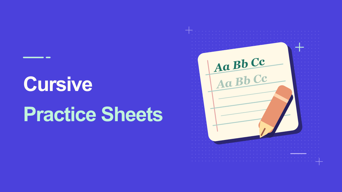
Typed cursive can serve as a visual model for handwriting practice, especially when you want to repeat a child's name, common letter joins, or a short sentence. It is not a replacement for handwriting instruction, but it can help learners see how letters connect before tracing them on paper. The challenge is choosing a readable script and leaving enough room for practice. This guide explains a practical worksheet layout, common letter-pair exercises, and how to avoid confusing decorative calligraphy with everyday cursive writing.
Understanding Cursive Handwriting Practice Sheets From Text
A handwriting practice sheet needs consistency and clear structure. Students usually benefit from baseline guidance, visible examples, and space to repeat a pattern. A font generator can create a reference word or phrase, but may not automatically provide traceable letters, dotted strokes, or lined paper. Treat the exported name or sentence as one part of a worksheet you assemble, and avoid promising a dedicated tracing feature unless the live tool includes it.
A cursive handwriting generator can make typed letters appear as joined script, but a font-based result is not the same as a person writing by hand. The character shapes, spacing, and joins repeat predictably. That is useful for invitations, practice material, headings, and decorative signatures, provided you do not misrepresent a generated mark as proof of consent or identity.
Practical Steps for Cursive Handwriting Practice Sheets From Text
1. Choose a simple handwriting style
Use the Cursive Handwriting Font Generator and select a neat, minimally decorated script. Avoid large wedding-style flourishes for beginner practice. Clear joins and ordinary proportions are more useful than dramatic capitals.
2. Begin with easy letter connections
Try repeated combinations such as 'li,' 'in,' 'el,' and 'an.' Small groups help a learner focus on the movement between letters. The aim is not to draw an artistic logo, but to recognize a dependable writing pattern.
3. Build a worksheet with examples and blank rows
Place one generated line at the top of a page and leave guided blank lines beneath it. If you create a separate worksheet in a document editor, use consistent margins and enough vertical space for descenders. A thin grey model can be useful, but test whether it prints clearly.
A helpful way to check this step is to pause before publishing: look at the preview at actual phone size, confirm the main words are still readable, and try a plain-text version if a platform changes the characters.
4. Add meaningful names and short sentences
After letter pairs, include the learner's name and a phrase such as 'I can write neatly.' Keep sentences short enough to practice without frustration. If the script font forms a confusing letter, switch styles rather than teaching an awkward shape.
5. Print a test before making copies
Inspect the page at real size. Check baseline, slant, joins, paper margins, and the space between practice rows. A beautiful screen preview can produce strokes too faint for a home printer or lines too close for comfortable writing.
Keep a copy of your original wording outside the generator. That makes it easy to revise the message, compare versions, or retry a simpler style when the destination does not support every symbol.
Practical Examples You Can Adapt
First-name practice
Place the child's first name in clear cursive at the top, then add three empty practice lines below. Repeat with lowercase only if the learner is still working on basic joins. Personal words can feel more motivating than random phrases.
Daily five-minute practice
Use one short pair of letters and one common word on each daily sheet. Encourage slow, controlled movement rather than racing through dozens of repetitions. A small habit is easier to maintain than a packed page of complicated strokes.
Why Cursive Handwriting Practice Sheets From Text Can Look Different
There are two common outputs: decorative Unicode script that can be copied as characters, and a rendered image or vector file that preserves the chosen letterforms. For print and graphic design, an image or SVG can maintain visual consistency. For a social caption, copyable characters may be more convenient but can display differently across platforms.
Using highly ornate script
Decorative calligraphy can include unusual letter shapes and long flourishes. Beginners may copy those details instead of learning ordinary cursive patterns. Choose a straightforward handwriting style for instruction.
Assuming typed models are perfect teaching guides
A font is a visual example, not a demonstration of stroke order or pen pressure. A teacher or handwriting resource may be needed for correct movement. Use the generated text as support, not as the sole lesson plan.
Example Weekly Practice Progression
On day one, choose two easy letter pairs and write each one slowly a few times. On day two, turn those pairs into short words. On day three, practice a first name or familiar place name. On day four, write a gentle four-word sentence. On day five, repeat the hardest connection from earlier in the week and compare legibility rather than speed. This is a flexible practice pattern, not a formal curriculum; adapt it to the learner's comfort, age, and instruction.
Make the worksheet inviting rather than dense. Leave room for handwriting and avoid marking every imperfect curve as a failure. A typed cursive model may not explain stroke direction, so a teacher or good handwriting resource is helpful when someone needs instruction in how the pen should move. Encourage the learner to rest their hand, use comfortable paper, and stop if practice becomes physically uncomfortable. The generator should make examples easier to customize, not turn handwriting into a competition over ornamental loops.
Practical Tips for Cursive Handwriting Practice Sheets From Text
A useful worksheet progression is individual joins, short words, names, and then sentences. Keep the layout predictable from one page to the next. If the learner finds a particular connection difficult, repeat that pair at a comfortable size and give feedback on legibility rather than artistic elegance. Save the original typed text so you can recreate a cleaner model when needed.
Always inspect loops and joins at the intended final size. A delicate font that looks beautiful at 80 pixels may blur at 12 pixels or fill in after printing. Test capitals, lowercase connections, punctuation, spacing, and descenders such as g, j, and y. Legibility matters more than the number of flourishes.
Frequently Asked Questions
Can a font generator create tracing worksheets automatically?
Not necessarily. Some tools export handwriting text only. You can place those examples into a separate worksheet with guidelines, or use a specialized tracing feature if the live tool provides one.
Which cursive style is easiest for beginners?
A clean, consistent script with recognizable joins and few flourishes is usually better than decorative calligraphy. Readability and repetition matter most.
How much space should I leave for a learner to copy each cursive example?
Leave a blank ruled line directly below each model. If the learner is practicing tall loops or descending strokes, include enough vertical room for those movements before the next example.
Try It Yourself
Once you know the outcome you want, open the Cursive tool, enter a short sample, and adjust the result until it remains useful in its destination. For a related approach, read this companion guide. Try the simplest version first, then add decoration only where it improves the message.